
In 2026, Glasgow, Scotland celebrated the 10th anniversary of one of Europe’s largest graffiti and urban art festivals: Yardworks.
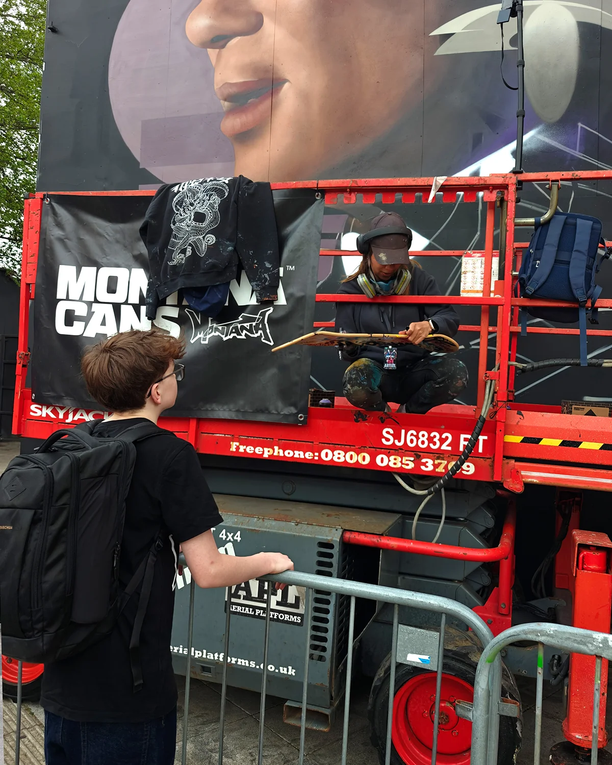
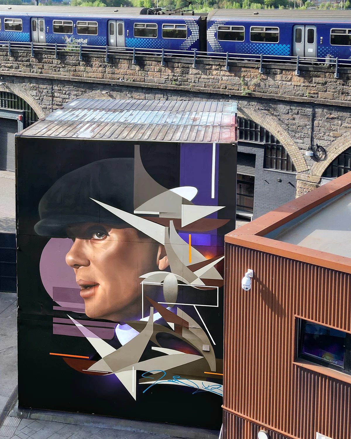
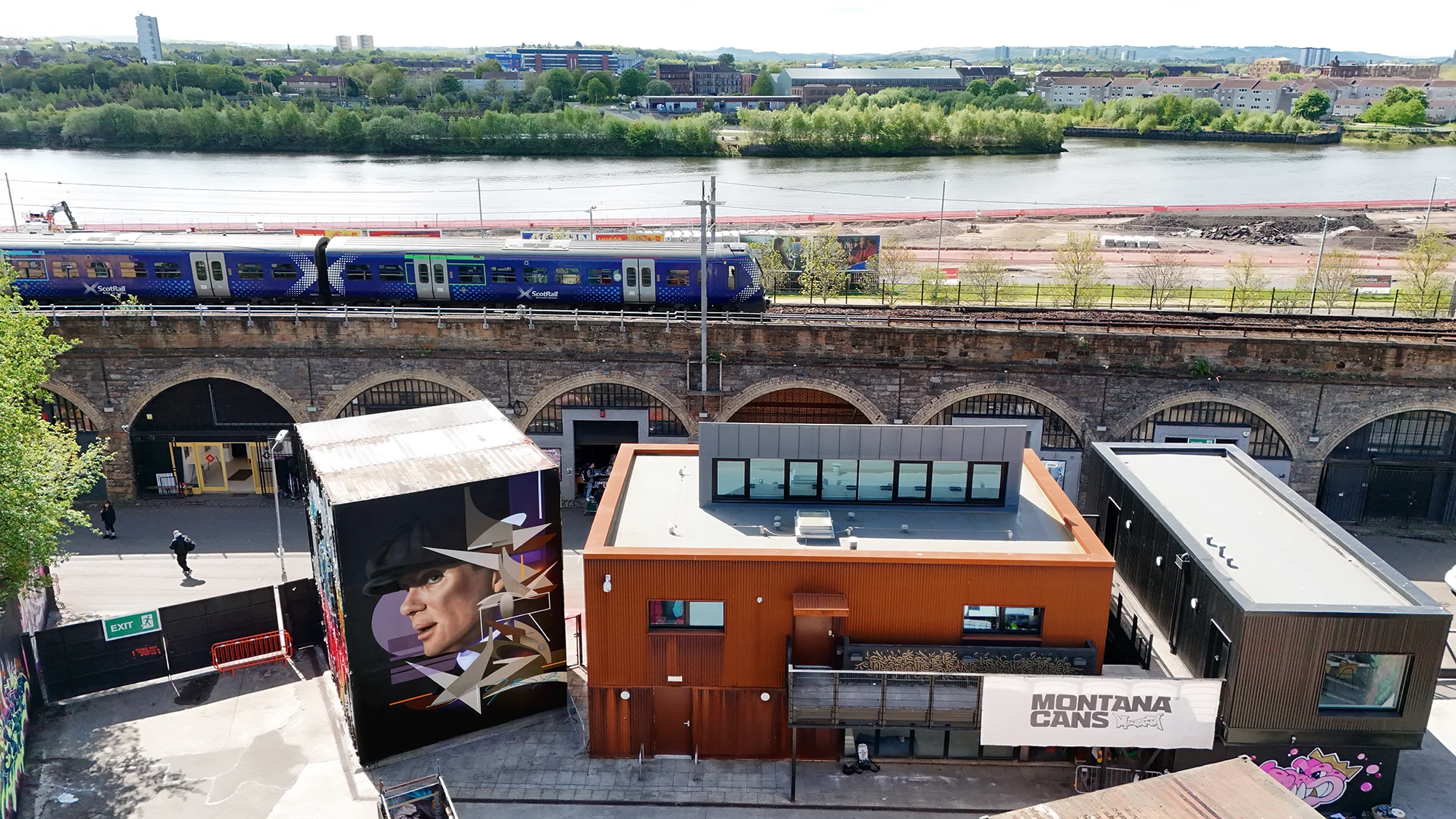
For this edition, I was invited to paint in one of the spaces specifically created for the event, which consists of 3 stacked shipping containers forming a wall approximately 9 meters high by 6 meters wide. This is my third time participating in the festival, and on this occasion, I wanted to try something different.
WHY TOMMY SHELBY?
For some time, I had been following Cillian Murphy‘s career. The first film I remember seeing him in was BATMAN BEGINS, where he played the Scarecrow, followed by INCEPTION, A QUIET PLACE 2, and more recently OPPENHEIMER.
I watched all six seasons of PEAKY BLINDERS and the recent film this year. I was drawn to it by its protagonist and a plot featuring a character who is neither hero nor villain, but simply a man carrying the weight of his decisions and the responsibility for those in his care. I chose him for the character development and Cillian Murphy’s performance, whose features and gaze are so distinctive. I was looking for alternative references to female faces, with a character that reflected confidence, melancholy, and a certain ambiguity.
If you review my work, my characters often have similar gazes and expressions: peaceful but not docile, reserved, strong, intelligent, self-assured, yet with a certain nostalgia and reflective calm.
IN SEARCH OF THE REFERENCE
Finding a reference for such a well-known character has its pros and cons. On one hand, you have a lot of material to choose from; on the other, there are certain iconic images that are repeated, and finding one that fit what I was looking for took some time. These are some of the ones I considered for the design:
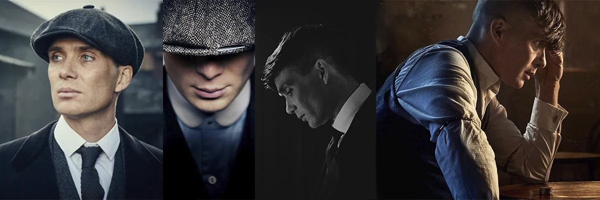
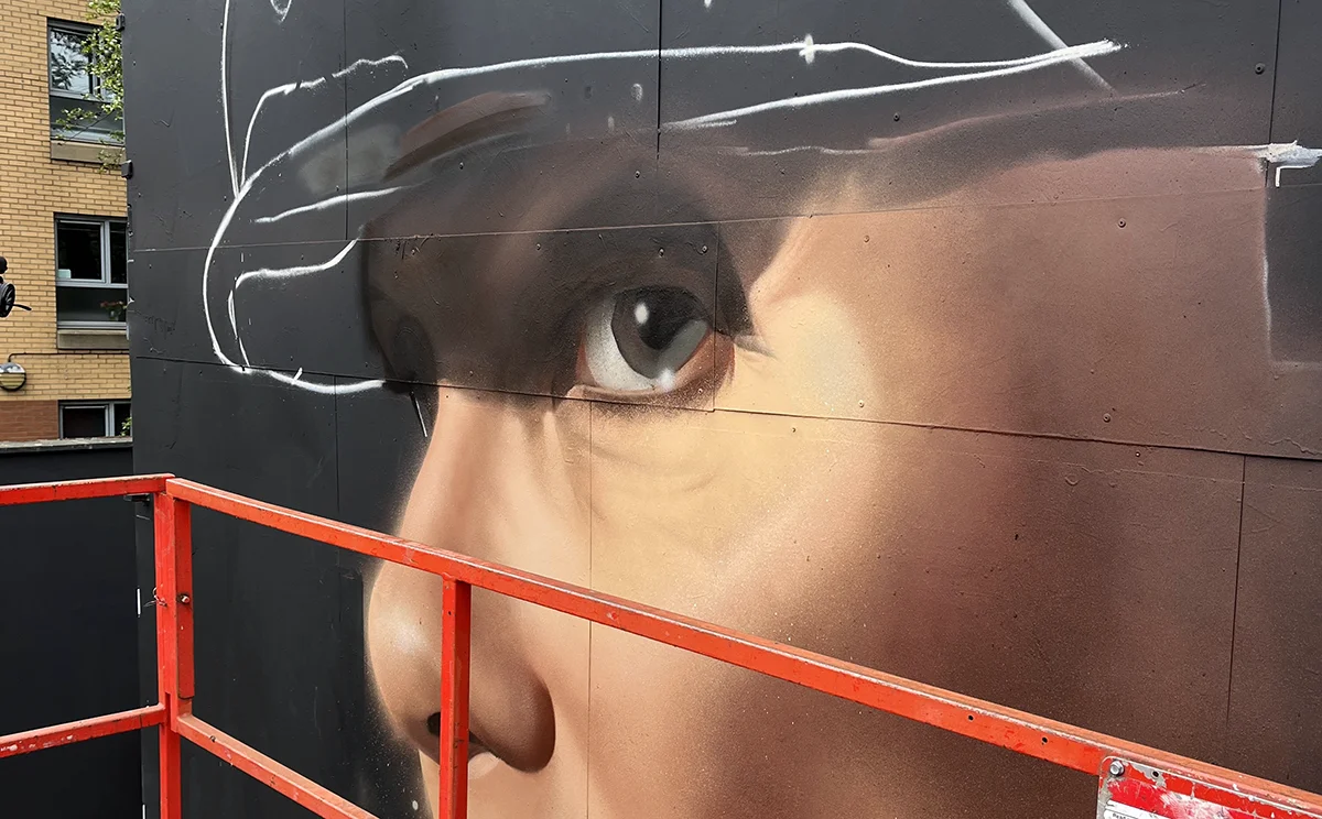
For me, it was important to choose one where he wasn’t smoking and had his characteristic cap, partly perhaps because the actor mentioned in several interviews that he really disliked the haircut, and I felt the need not to portray him that way. I also decided not to paint him with a scarred face, as I did not want to emphasize violence. I chose the photograph I did based on how well the detail in his eyes could be seen and the distinct shadow the cap cast over his face, which gives it a somewhat dramatic touch.
ABOUT THE COLORS
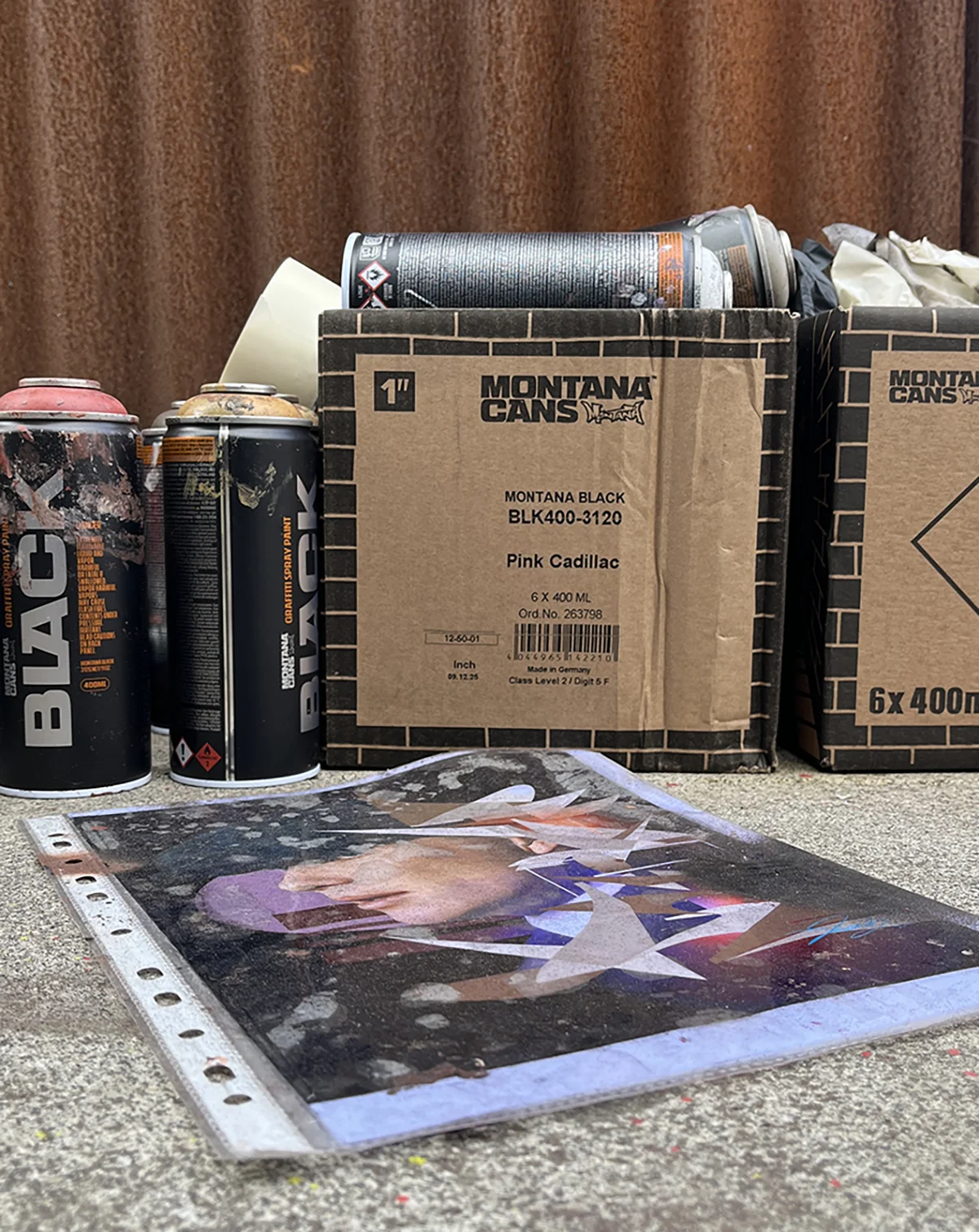
I chose them long before selecting the character. This year, I am moving in a different direction regarding color, experimenting with more desaturated tones and mixing spray paint to achieve new colors that align with what I want to paint. I really like the contrast between this desaturation and the use of small amounts of more vibrant colors. Previously, I used white to bring light to murals, but lately, I find that depending on the tone and quantity, I can play with certain colors to achieve a better result.
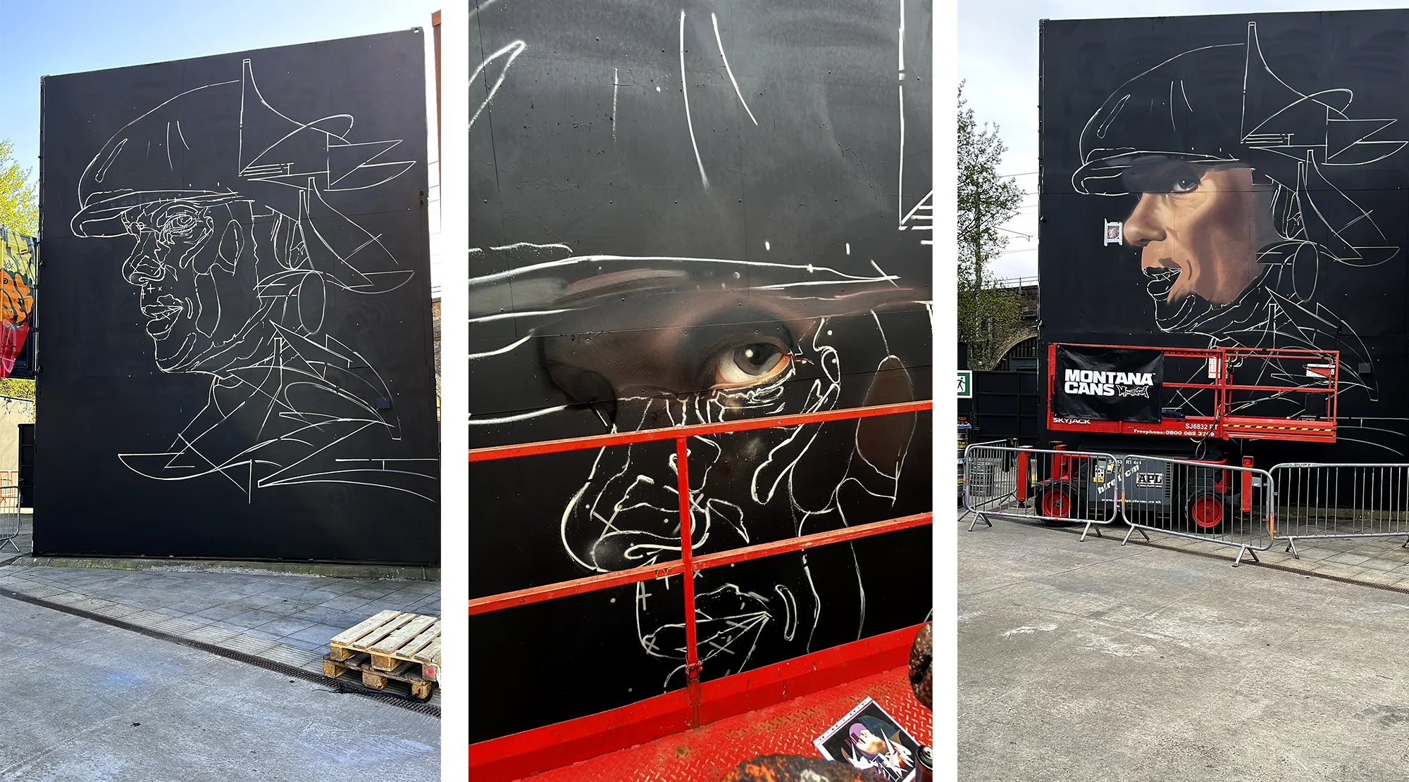
PROCESS AND FINAL MURAL
In total, it took me 4 days to complete the mural: the first for the baseline and color testing, the second for the face, the third for the lettering, and the fourth for the details. The mural’s position was backlit all day; fortunately, it was quite cloudy, which allowed me to get good photos of the making-of. Most of the photographs were taken in the morning hours when I made faster progress on the more complex parts, and in the afternoon, I focused on refining details. These are some of the making-of images along with the final photo of the mural.
I must thank Gaz and Laura (organizers) for their invitation and for another year of a magnificent festival.
If you’ve made it this far, thank you very much, and I hope you like it!